 zk School
ZK School Brand Guidelines
The visual language behind the gamified zero-knowledge learning portal — colors, typography, and components drawn straight from the live theme tokens.
Logo

Primary · on dark
PreferredOn light surface
#F2F5EE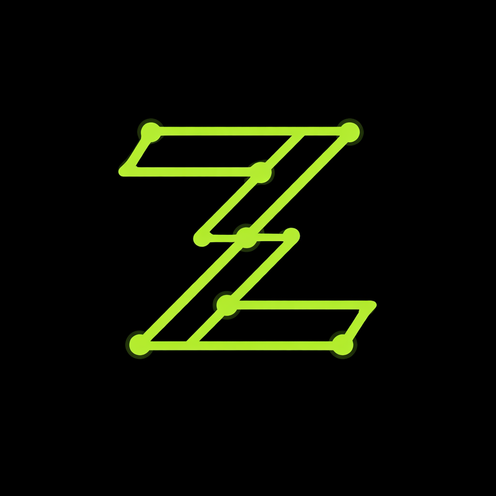
Clear space
Keep padding of at least the height of the Z cross-bar on every side. Nothing crowds the mark.
Minimum size
Never render below 24px on screen. The node dots must stay legible.
Don't
No recoloring, stretching, rotating, drop-shadows beyond the brand glow, or placing on busy imagery.
Brand
ZK Green
--zk-green
#A8F072
ZK Accent
--zk-accent
#6EE03A
Surfaces
Background
--bg
#0A0A0A
Surface
--surface
#111411
Card
--card
rgba(17,20,17,0.5)
Text Hierarchy
Text — the quick brown fox--text
Text 2 — the quick brown fox--text-2
Text 3 — the quick brown fox--text-3
Text 4 — the quick brown fox--text-4
Typography
Display / Sora
Prove it. Privately.
Heading / Sora
Zero-knowledge, end to end
Body / DM Sans
A gamified learning platform for zero-knowledge proofs and privacy technology.
Mono / JetBrains Mono
const proof = generate(witness)
Buttons & Badges
Cards & Effects
Glow Card
Glass surface with hover lift, border bloom, and accent glow.
Glass
Frosted blur over the background, subtle accent hairline border.